Understanding BEM The Basics
BEM Block-Element-Modifier is one well-known naming convention for writing CSS that dramatically increases cleanliness, structure, and maintenance. It has been established by Yandex, a technological company in Russia, and helps developers avoid problems such as style collision, tangle codes, and difficulties in maintaining large stylesheets.
At the heart of BEM is an intelligent way to reach from both ends into CSS class names. This makes the code more readable and CSS scalable, which is a must when working in a growing team or context with a complex project. Rather than using imprecise class names or big names, BEM insists on being as readable and yet artificial as possible. A block would, for example, be named menu, with one of the elements: menu__item, and a modifier: menu__item–active.
By having clear guidelines on what each class adheres to, the much-congested space with naming conventions for many teams really gets to breathe under BEM. You immediately understand how a class fits into the whole design. You save a lot of brain power because you are not seeking to second-guess what a class name does or where it belongs.
On an average project without BEM, you will have CSS files that end up in classes like .button, .button1, .btn, and .btn-primary. Tracking gets hard after that. But with BEM, it would be like but- ton, button__icon, and button–primary. Everyone realizes what a button is without explaining it much, and they understand what kind of button it is-the feature, or fault, it contains. Very few people get bugs, and others get great collaboration.
BEM is equally efficient here whether you are building a static site, or you are delving into React, or Vue. Teams that follow this will generally write more modular CSS in their applications, which is always a benefit regarding collaboration and longevity.
Breaking Down the BEM Methodology
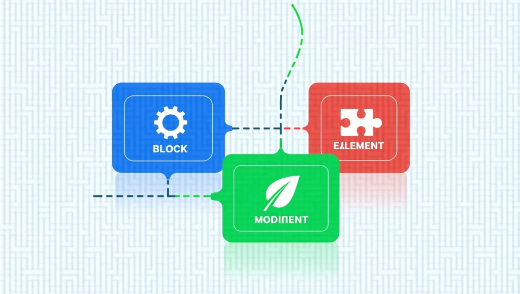
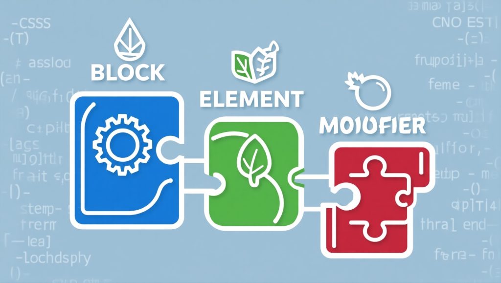
The power of BEM lies in its simplicity and structure. Let’s break down the three main components: Block, Element, and Modifier.
- Block: This is the outermost parent element that represents a standalone component. For example, a navigation bar could be named nav or menu.
- Element: These are parts of the block that have no standalone meaning and are tied directly to the block. For example, menu__item would be a menu item that lives inside the menu block.
- Modifier: These are flags on blocks or elements that change their appearance or behavior. For example, menu__item–active would indicate the active state of a menu item.
This principle decreases conflicting styles, everything gets clearly scoping. You know let’s say that there is a menu__item; it will only be provided inside the menu block but won’t touch any similarly named items somewhere else. This makes it impossible for things like unintended overrides or conflicting rules from common CSS source problems to occur.
Consider a webpage containing a login and signup form. Say you create a class called .form-button or .input-field; without any organization, those classes might end up conflicting. Using BEM systems would allow you to classify cleanly the styles like login-form__button and signup-form__button.
Unique, contextual names for all components and subcomponents allow teamwork without stomping on toes. It will further ease debugging styles because each class name contains hints about the structure and purpose underneath.
Why Should Teams Adopt BEM for CSS?.
Without complication, teamwork makes the webs these days, and so BEM provides a formatting standard to write CSS. When one approach is used by every developer on a team, it is nothing less than pure bliss. It takes away confusion, spends less time, and keeps the code database simple to understand.
With BEM, one no longer has to “guess” the intention behind a class. One will know immediately. This is particularly useful for larger teams or when inducting new members. And everybody shares the same “language”, strictly when it comes to naming and organizing styles.
Modularity is another benefit. Every block can be developed, tested, and reused independently. A huge time-saver for teams building some sort of design systems or component library. You build a card block with elements like card__header, card__body, and card__footer, which can then be reused across the site with different modifiers, such as card–highlighted.
In addition, BEM fits in well with modern development tools and frameworks. Be it SCSS, LESS, or even Tailwind CSS, BEM-style naming can be integrated seamlessly. It is framework-agnostic, thus making it a future-proof choice.
Besides the fact that it boosts productivity for businesses in charge of web design teams or SEO specialists, it can also be said to increase productivity even more. You spend less time fixing styling issues and more time pump-up user experiences and performance.
And let us not forget accessibility. When your code is simple and well-structured, helper applications and screen readers generally perform better, indirectly aiding toward more accessible websites—obviously.
How BEM Helps Teams Avoid Common Pitfalls
Without complication, teamwork makes the webs these days, and so BEM provides a formatting standard to write CSS. When one approach is used by every developer on a team, it is nothing less than pure bliss. It takes away confusion, spends less time, and keeps the code database simple to understand.
With BEM, one no longer has to “guess” the intention behind a class. One will know immediately. This is particularly useful for larger teams or when inducting new members. And everybody shares the same “language”, strictly when it comes to naming and organizing styles.
Modularity is another benefit. Every block can be developed, tested, and reused independently. A huge time-saver for teams building some sort of design systems or component library. You build a card block with elements like card__header, card__body, and card__footer, which can then be reused across the site with different modifiers, such as card–highlighted.
In addition, BEM fits in well with modern development tools and frameworks. Be it SCSS, LESS, or even Tailwind CSS, BEM-style naming can be integrated seamlessly. It is framework-agnostic, thus making it a future-proof choice.
Besides the fact that it boosts productivity for businesses in charge of web design teams or SEO specialists, it can also be said to increase productivity even more. You spend less time fixing styling issues and more time pump-up user experiences and performance.
And let us not forget accessibility. When your code is simple and well-structured, helper applications and screen readers generally perform better, indirectly aiding toward more accessible websites—obviously.
BEM in Action Real-World Examples
Let’s say you’re building a user profile card. Here’s how BEM might be applied:
<div class=”profile-card”>
<img src=”avatar.jpg” class=”profile-card__avatar” />
<h2 class=”profile-card__name”>Jane Doe</h2>
<button class=”profile-card__button profile-card__button–follow”>Follow</button>
</div>
In this example:
- profile-card is the block
- profile-card__avatar, __name, and __button are the elements
- profile-card__button–follow is the modifier
There is no ambiguity in the naming structure. You clearly know where each style belongs and what it affects. It is easy to target, reuse, and modify later without breaking other areas of the site.
For teams building large-scale things like ecommerce sites or enterprise dashboards, they often manage complex UI elements. BEM makes sure every element remains predictable and manageable, no matter how many features you add.
You can even integrate BEM with tools like SCSS to nest styles logically:
.profile-card {
&__avatar { /* styles */ }
&__name { /* styles */ }
&__button {
/* styles */
&–follow { /* styles */ }
}
}
This makes your code more readable and fits perfectly with how developers think about UI components.
If you are planning a redesign or a migration to a modular CSS methodology like BEM, it can significantly boost maintainability. You will have to take the time to learn it, but you will be able to benefit greatly.
When to Use BEM and When to Avoid It
Although BEM is very helpful in general, it may not be the best option for every project. For example, small websites or one-off pages may feel just a bit too verbose. Writing header__nav-item–active instead of simply .active may seem a little unnecessary when you are only manipulating a few headers on a page.
For teams looking for scalable web apps or managing codebases that will have longevity, BEM is great! It takes away the suspense and makes your styles more “future proof.” It is also a good choice for situations when there are multiple developers working together like an agency and/or open-source environment.
On the other hand, if you’re working with CSS-in-JS architectures or utility-first frameworks such as Tailwind CSS, BEM may be less relevant since there are already built-in ways to avoid style conflicts and maintainable styles.
Ultimately, you have to consider your team requirements. If you value clarity, structure, and collaboration in your coding style, BEM is a solid choice in your development process. But that doesn’t mean you have to use it everywhere; like other techniques, it is best used in the right situations.
Conclusion
In web development, structure counts. A CSS style sheet that is unreadable, unmaintainable, or unscalable can slow progress to a crawl. This is why adopting a clear and consistent methodology, such as BEM, can be advantageous for your team.
BEM brings clarity to a group of chaotic CSS classes. It leads to improved collaboration, fewer bugs, and helps your team create scalable, modular styles that last. You and your team have less to think about, spend less time fixing problems, and more time building wonderful user experiences when everyone is following the same naming pattern.
Whether it’s a portfolio site, an enterprise dashboard, or a dynamic website design Swansea project, BEM keeps your codebase tidy and workflow in check.