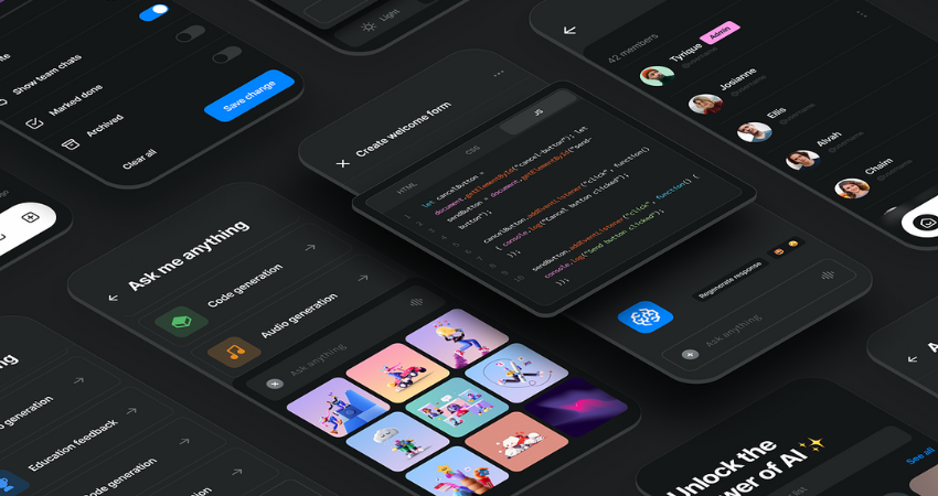
Dark mode, a pretty recent concept, has gained traction all throughout digital space-from operating systems to mobile apps and websites. Initially, a thing for the night owls and tech enthusiasts, it is now being moved to the realm of casual users for some very obvious reasons. So, dark mode is more than just a trend or style preference. It is an elegant design choice that may enhance usability, accessibility, battery life, and health of your eyes. In this article, we will explore the rationale behind such consideration for dark mode and its effect on the design of present-day web and app development.
The Rise of Dark Mode in UI Design
Turning from fad to trend, dark mode has gained traction in recent years: users expect it of applications, sites, and even the settings of their systems. Why does it have to be so important? Just because it is chic, cool, and modern, it makes good glare reduction effects in the experience as well.
The History Behind the Shift
Dark interfaces are not new. They used to be, earlier, the standard norm—think of all those DO systems or aged computer terminals. Then graphical interfaces came along to change all that, and the white backgrounds became the norm. Fast forward to today, and we’ve come right back round again. Mobile operating systems like iOS and Android integrated dark modes across all parts of the system, and then web developers remade websites in such a way that users did not just like it but had to expect it.
It is more than just ‘I prefer it.’ It’s giving control to the user. It’s more about ease for the eyes while looking at the environment controls for longer runs, particularly while seeing at night. It shows how design trends can change with actual needs and habits, rather than purely aesthetic reasons.
Benefits of Dark Mode for Users
There exists a reason behind the cause for users switching to dark mode-and that is not that it looks cool. Dark mode provides actual functional expanded user experience in some real ways.
Reduced Eye Strain and Glare
Confronted with brightly lit screens even in dim environments can be an assault on the optic nerves. Dark mode can reduce glare and provide relief, especially when screens are used heavily. It is particularly useful at night or in dimly lit environments. The dark screen has less overall brightness, which lessens the strain that comes with staring at white backgrounds for hours on end. Such settings can be particularly soothing for those with photophobia or migraines provoked by elevated brightness. While dark mode is no panacea for eye health, many users clearly find it to be the lesser of two evils from the standpoint of comfort.
Energy Efficiency and Battery Saving
Dark mode is conventionally thought of in inverted order concerning visual comfort, but it has some crucial technicalities, such as battery life in mobile devices.
OLED Screens and Power Consumption
Dark mode can extend battery life, although the extent to which it does so is contingent on the type of screen used by the device. OLED (Organic Light Emitting Diode) screens, used in most of the high-end smartphones, light up the individual pixels to display the colors on the screen. Essentially, when a pixel is black, the pixel is off and uses either very little or no power at all. Thus, the argument is that the more black there is on your screen, the less power will be consumed from your battery.
So, in a nutshell, switching graphics to dark mode is useful for heavy smartphone users, thereby offering them hours of extra battery support across different apps. It indeed is a small and oft-ignored benefit; however, in real-world situations, it adds tangible value, especially to those always on the go and with little or no charging options available.
Accessibility and Inclusivity in Dark Mode

Design doesn’t just concern looks-it is also about accessibility. Dark mode partakes in the improvement of access for several users. Yet, as with all designs, thoughtfulness makes it effective.
Color Contrast and Readability
Thus, while some would argue the dark mode enhances readability, others contend that it can be tumultuous in the hands of careless implementation. Hence, the most important thing to consider is the contrast. If the text is too dim or the background is not dark enough, it becomes hell on the eyes to read. Accessibility guidelines specify a minimum contrast ratio of 4.5:1 with respect to body text for readability in varying lighting situations.
It is another few important things that the background should not be pure black and the text should not be pure white since halation can occur- the white text glows or seems to blur, and in either case, it is harder to view. The best option is choosing off-black for the background and soft gray or any light-colored hue for the text.
Dark modes perform extra good for users with low vision, light sensitivity, or certain neurological cases by becoming ever-comfortable and inclusive.
Implementing Dark Mode in Web Design
While it seems like dark mode is the latest sensation, good implementation requires more than just knack to be able to with-it. It entails much more than just swapping colors; it is ensuring that the entire design system is adapted to guarantee a seamless and accessible experience for the user.
Using CSS and Design Systems
Most dark modes are implemented with CSS variables or the prefers-color-scheme media query that detects user settings and renders content suitably. That means users who select dark mode at the device settings level will see your website in dark mode too.
Designers need to create two palettes: one for light mode and one for dark mode, which involves all elements, including text, backgrounds, hover states, shadows, and even illustrations/icons. Thus, UI design systems like Material Design and Tailwind CSS have integrated dark mode support, making it much more convenient for teams to embrace the functionality without creating it themselves.
Dark mode, when done right, enhances the brand and feels intentional- not like a hurried afterthought.
Common Mistakes to Avoid
Even though there are advantages with dark mode, there are pitfalls that designers and developers often fall prey to. These errors have the potential to vex users or make the feature positively useless.
Poor Contrast and Unreadable Text
Low contrast is one of the most significant issues. If colors aren’t carefully chosen, users may find it difficult to read content. This happens when text disappears into the background or hover effects disappear. Always test your contrast with a contrast checker like Web AIM Contrast
Checker to become compliance with the accessibility standard. Besides that, inconsistent styling is another mistake; some parts of the site would go into dark mode while others wouldn’t. This kind of disjointed experience breaks immersion and confuses users. Test across all pages of your site, all UI elements, so that dark mode feels polished and complete.
Conclusion
The dark mode is much more than just a passing design trend. It is practical, user-centered, and enhances accessibility, comfort, and increased performance. Therefore, in the ever-evolving technology with ever-changing user expectations, dark mode is no longer just a “nice to have”; it is becoming a true best practice in design.
The new site or a revamped site must be built with consideration of Dark Mode at the beginning to grant the customer a flexible, modern, and comfortable experience. Dark mode, when done carefully, should not just be an aesthetic preference but a viable component of your UX strategy.