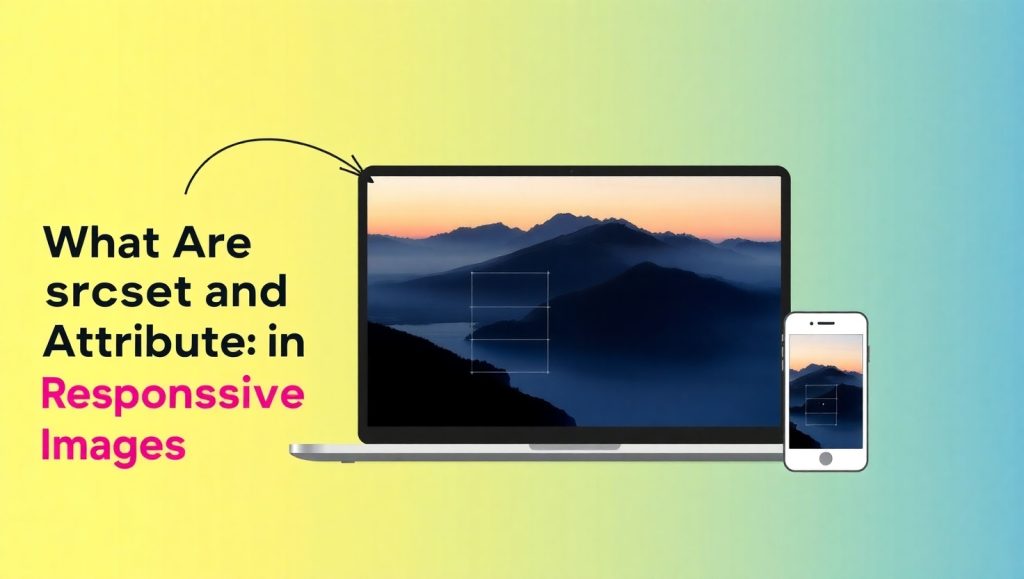
In the age of responsive web design , flexibility is not confined only to text and layout; rather, images also require flexibility according to screen sizes and resolutions. This is the job of the srcset and sizes attributes, which function in relative unison to fetch optimum images for varying devices, maximizing performance along with the user experience.
On one hand, your user might be sitting at a 4K desktop monitor, and on the other, he might flip out his mobile phone and check out your site on a screen the size of his tiny pinky. When you serve high-resolution images, you risk either choking the bandwidth or compromising on the quality of images, and that is where srcset and sizes come into play; three or more image variants can be defined as srcset values, and with sizes, you can define which one of those images should be used depending on the screen characteristics. The smart choice of image for you is like giving your site small brains.
So here’s the deal: if you think you have heard of responsive images without understanding what really goes on behind the scenes, do not worry—we will cover it all for you. Everything from what srcset tells you about your image variants to how sizes helps the browser to use one—hard yet friendly. Let’s get cracking.
Understanding the srcset Attribute
The srcset attribute allows you to define a list of image sources with different widths or pixel densities. This helps your browser decide which version to display based on the user’s device. In practical terms, srcset is like giving the browser a menu of image choices: you list different versions of your image file, each one designed for a different screen size or resolution. For example, there may be a small version for mobile phones, a medium one for tablets, and a large version for desktops.
Here’s a basic example:
<img
src=”image-400.jpg”
srcset=”image-400.jpg 400w, image-800.jpg 800w, image-1200.jpg 1200w”
alt=”A scenic mountain view”>
In this case, image-400.jpg has a width of 400 pixels and so on. The browser will compare the sizes of the images in the srcset files and select that which is most appropriate according to what is known about the user’s screen.
This is made very powerful by srcset in that it does cut down on loading time. A very small viewer on a slow connection need not rely on downloading a large, high-res image- that is sheer waste. Using srcset, one optimizes the performance of the website while still delivering excellent images.
This attribute, while related mostly to responsive page structures, also helps promote the use of incredible high-density screens like Retina displays. A crisp image that fits well is served with srcset rather than trying to scale to greater size a little low-resolution image, which looks quite blurred.
How srcset Enhances Site Speed and User Experience
Speed and Experience go together in web design. If a site is too slow to load, users might bounce before they even get to see the splendidly designed homepage. srcset works against this by loading only an image size that is necessary for the screen being used.
Picture someone visiting your site on something low-end with slow data. If the user is not employing srcset, their browser will download a 1200px image that is required only in 400px. Truly excessive and very poor on the user experience.
Now take the reverse. A visitor opens your site on a 4K monitor. If you serve them a 400px image, it will appear pixelated and blurry. Another bad experience. But srcset saves the day.
Here’s another example, but this time targeting pixel density:
<img
src=”image-lowres.jpg”
srcset=”image-lowres.jpg 1x, image-highres.jpg 2x”
alt=”Product image”>
In this case, users with high-resolution (Retina) displays will get the sharper version. You don’t need JavaScript or complex CSS tricks—just good HTML.
By using srcset correctly, you make your site faster, more efficient, and better looking across all devices. It’s one of those small changes that can make a huge impact on performance and UX.
Exploring the sizes Attribute

The attribute sizes works independently but alongside srcset. srcset indicates options of images without specifying what the browser should decide, while sizes helps the browser by telling how big the image will be in different conditions.
Consider it a suggestion for layout: you’re saying “this will be about half the screen size” or similar to let the browser choose the correct image from the srcset list before seeing anything else.
Here’s a practical example:
<img
src=”image-400.jpg”
srcset=”image-400.jpg 400w, image-800.jpg 800w, image-1200.jpg 1200w”
sizes=”(max-width: 600px) 100vw, (max-width: 1200px) 50vw, 33vw”
alt=”Team at work”>
This tells the browser:
- On screens up to 600px wide, the image should take up 100% of the viewport width.
- Up to 1200px wide, 50%.
- Otherwise, 33%.
With this information, the browser makes a smart decision and chooses the most efficient image file before downloading it. That means no unnecessary downloads and a smoother load time.
How sizes Works with CSS and Responsive Layouts
When utilizing CSS media queries and fluid layouts, the sizes attribute becomes an important one. It acts as some sort of blueprint for CSS, prompting the browser not to have to guess.
Consider a blog that has images full-width on mobile, half-width on tablet, and one-third on desktop. Instead of letting the browser guess the image size based on your CSS, you can tell it with sizes.
That”s important because browsers actually decide which image to download even before the CSS is fully loaded. The lack of a sizes hint might lead them to download an image that is either too large or too small.
Here’s how sizes aligns with your design intentions:
sizes=”(max-width: 768px) 100vw, (max-width: 1024px) 50vw, 33vw”
This tells the browser exactly how much horizontal space the image will take at different breakpoints. The browser then picks the most appropriate image from the srcset options.
The beauty of this approach is that it’s proactive. You’re not reacting to a browser’s decision—you’re guiding it. When used correctly, sizes ensures visual consistency while also minimizing load times.
Why Responsive Images Matter in Modern Web Design
The contemporary web depends on flexibility. Users are browsing on every kind of device imaginable-from smartwatches to massive ultrawide monitors. As a web designer or developer, it is your job to ensure your content looks great on all platforms.
Responsive images-and srcset together with sizes-help bridge that divide. They allow your site to serve content that is both beautiful and efficient. And when users get fast and richly visual experiences, they are more likely to stay, engage, and convert with the site.
That means it’s better for SEO. Google uses page speed as one of their ranking factors, and large images are often the most notable causes of slow-loading pages. Thus by serving images according to size, you could cut seconds off your load time-and it may make the most significant difference in bounce rates and ranking.
Furthermore, accessibility and the user experience go hand in hand. Clear and sharp images that load fast help all types of users, especially those with limited connections or older devices. In this way, responsive imaging does not just enhance your site-it enhances the inclusivity.
So whether you are building a site from scratch or redesigning an old one, responsive imaging has to be there with you in the toolbox. A small stride in coding-a giant leap in performance and professionalism.
.
Tools and Tips for Implementing srcset and sizes
Encapsulating the srcset and sizes tags does not need to be a complicated process; start out by creating multiple sizes of your image files using ImageMagick or online sites like Cloudinary. From there, include the attributes in your HTML as needed. If you’re using WordPress or any other CMS, modern plugins and themes will by default handle responsive images; so you may want to check and tweak it when necessary.
Here are a few tips:
- Always include an alt attribute for accessibility.
- Don’t go overboard with image variants—stick to three or four sizes.
- Test your layout on different screen sizes to ensure everything scales properly.
- Use browser dev tools to inspect what image version is actually being loaded.
Responsive image handling may sound a bit technical at first, but once you get the hang of it, it becomes second nature. And the performance gains are absolutely worth the effort.
Conclusion
At this time and place, there are simply no users who do not expect a fast and stunning site no matter what device they use. Image srcsets and sizes should be regarded as mandatory attributes instead of optional ones. Their function is that of serving the most suitable image depending on the screen size, resolution, and even layout. This would create a better load, user experience, and SEO benefits for everyone.
Applying srcset gives your browser a wide variety of images from which to choose a suitable one, giving crisp visuals for high-res screens or smaller images for smaller screen sizes. Using sizes tells the browser how much of the rendered space the image will fill, hence enabling it to make an optimal choice for downloading even before loading that pixel.
What makes this approach particularly appealing is that it certainly improves your site without complicating the process. It makes your design a little bit smarter and more adaptive, whether you’re building a personal blog or a major online retail site. It shows that you care not only about aesthetics but also about performance, inclusive design, and user satisfaction.